“Mine, Yours, Ours” Identity & Awareness campaign
Saint Paul Public Library
Innovation Synopsis
Saint Paul Public Library’s fresh new brand identity and awareness campaign is an exciting update to its decades-old design. The new brand and campaign build upon the idea that the library means something different to everyone and that is the beauty of it. SPPL’s new, flexible identity better represents the evolution of our libraries and the many types of materials, programs, and services we offer. This new brand is rooted in SPPL’s belief that everyone belongs at the library.
Challenge/Opportunity
The SPPL logo was last significantly updated in 2014. Throughout the past 20 years, the Library and the world around it have transformed in meaningful ways. To stay in step with these changes and reflect its mission and values, it was time to modernize. SPPL wanted its brand to be flexible, accessible, and adaptable, able to reflect the many services, spaces, and audiences or cultures that use libraries in St. Paul. This was an opportunity to refresh the brand and ensure that it embodies our commitment to innovation, belonging, and joy while aligning more closely with the City's broader brand identity. We’re often asked why updating the brand is a priority. We believe a logo is more than just a design—it’s a way to communicate who we are and what we value. Libraries today are places of connection—to information and resources, to new ideas and ways of thinking, and to each other. This new brand is an opportunity to tell that broader story and better connect with the people we serve.
Key Elements of Innovation
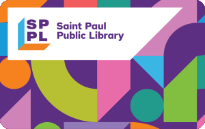
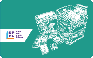
The refreshed branding launched on 1/30/25, designed by Twin Cities-based UNO Branding. Their thoughtful process incorporated accessibility, flexibility, and a sense of belonging, informed by community feedback. Input from patrons and staff across all SPPL locations helped shape the final design, with surveys offered in English, Spanish, Hmong, Somali, and K’Nyaw to ensure broad participation. The innovative logo features a two-toned shape intended to be open to interpretation. It’s a symbol of the many ways people experience the Library: an open book, a doorway into possibility, a cozy chair, a laptop, or the corner of your favorite room. Paired with a vibrant color palette and geometric patterns, the design represents the diverse ways our community uses the Library. In addition to the logo, the brand includes new colors, fonts, patterns, and imagery across our digital channels like the website, social media, and enewsletters. SPPL also updated signage, banners, and printed materials.
Achieved Outcomes
Feedback from staff and patrons has indicated significant improvement in systemwide brand cohesion. All library staff now have access to templates that are consistent, flexible, and customized to each branch location. These templates are legible, easy-to-use tools to promote library programs, services, schedules, partnerships, way-finding, and more. It allows the library to show up in different ways depending upon the age of the audience (little ones versus older adults) and lighthearted or fun programs versus serious topics.
One patron commented “Love this new brand!! Libraries are for everyone. Thank you SPPL for affirming this in a time where our most vulnerable communities are targeted.”
One long-time staff shared that this brand fits the moment - how SPPL creates library spaces where residents can be introduced to new and bold ideas, connect with neighbors across similarity and difference, and advance together as a community.
Supporting Materials